Modernist Types. Typography as Reading Instructions
1In this colloquium we have discussed the performing writer, and I would like to take a step back and ask a question about the term performance. Although this concept is at the heart of critical theory in the last few decades, it seems that we still tend to hold a certain dichotomy with regards to performance, placing performance as a “real life” action in which an actual body or voice is involved, as opposed to text as a written, abstract, raw material. When we are talking about the performance of a written work we tend to consider the action of taking the abstract text and embodying it through voice, movement, action, staging and so on. In other words, we tend to place performance as something that happens outside a written text.
2However, I would like to shed light on the performance of the writer as it is manifested in the text. I focus on one intriguing textual device: typography – the arrangement of words and other symbols on the page in different sizes, locations and compositions. I focus on cases where we notice the effort to embody, within the text itself, through typography, performative elements such as rhythm, sound, pitch, and more generally “body” in “space”. In those cases, the text actually becomes a space for a bodily experience and blurs the allegedly solid boundary between writing and performance, text and body, corpus and corps. These kinds of texts are what Jennifer Buckley termed “performance texts”, which use “theatricalist typography”, texts that aim at “expanding our sense of what is possible onstage and on the page”.1
3Performing through the materiality of writing is certainly not modern, and it has a very long history. Calligraphy in Japan is only one example of an act of writing that involves performance – the very act of writing is often displayed in public as a performative act. But what happens when the act of writing by hand is replaced with the modern industrialized print, and with the generic, unified, interface of type? Seemingly, there is a certain competition between type as a duplicated, structured, anonymous production (in fact the word cliché originated in the world of print – cliché was the name of the print pattern), and performance as a live, one-time, unduplicated act. Type and performance seem to contradict each other; So how can writers perform with type?
4I focus on a specific moment at the beginning of the 20th century when the use of experimental typography seems to have acquired a special role as a medium of performance. I would even claim that we can talk about a ‘‘typographic zeitgeist’’ in the early 20th century, when performative typography becomes one of the markers of the era.2
5This typographic moment originated in the experiments of early modernists such as Stéphane Mallarmé (Un coup de dés), Guillaume Apollinaire with his concrete poems, or “calligrams” (such as il pleut – where the event of rain is represented through type). This typographic theatricality was an integral part of the theatrical nature of modernist movements, reaching its peak with Futurism and Dada.3 These movements’ public performances were preserved in their literature, which often consisted of experimental typography. In Filippo Tommaso Marinetti’s technique of “parole in libertà” the sentences “long live Futurism” and “Poetry being born” [fig. 1] actually create a shout in the text through the enlargement of font sizes and give the reader performative reading instructions.4
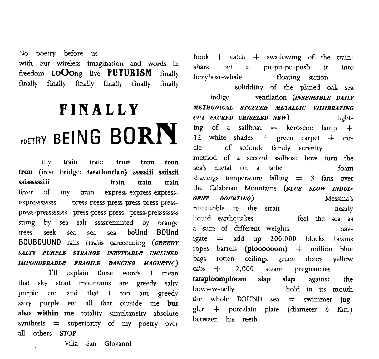
Figure 1: Marinetti, Zang Tumb Tumb, excerpt
6The motivation of these typographic experiments of modernist and avant-garde movements was rebellious: it was a protest against dominant aesthetic norms and an attempt to connect literature to the sensual experience of modernity. Abstract as some of these experiments may seem, they actually played a double role: A challenging aesthetic experiment indeed, but at the same time an attempt to create a link between literature and experience, text and body.
7But the typographical experiments rapidly gained another role. Experimental typography became a convention in modernist writing. It seemed that in order to merge into the thriving modernist creative world you had to use theatrical typography. Or in other words: In order to be a modernist type – a modernist type of person – you had to perform with type.5
8Performativity and experimental printing – were in a way two basic expectations from a proper modernist. Experimental typography, or “modernist type”, was of course an innovative literary device that challenged the traditional literary practice, but very rapidly it became a convention that marks one as a typical modernist writer.
9My case study will demonstrate how typography played this triple role: an experimental literary device, a performative device for the writer, and a device for marking one as a typical modernist.
10The case is quite a rare one, certainly not canonical, and it is a typical example of what is nowadays coined as “FFM” or a “Forgotten Female Modernist”. I am talking about an English female modernist, one who influenced the literary field more than we can imagine, but unfortunately, as opposed to some contemporaries, was almost erased from the literary genealogy. Only recently did she receive new attention as a prominent modernist: Hope Mirrlees [fig. 2].6
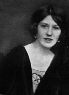
11Figure 2: Hope Mirrlees
12Mirrlees was part of the Bloomsbury circle in England and she was friends with Virginia Woolf, Gertrude Stein and T. S. Eliot. She was apparently a highly intelligent, elegant and eccentric woman. She studied classics in Cambridge where her teacher was Jane Allen Harrison, the famous classicist who later became her life-partner. They lived together for many years, and their trip to Paris was the biographical experience behind the work Paris.7
13Paris [fig. 3] is an ultra-avant-garde, experimental long poem (it’s as long as 600 lines) – published in 1919 by the Hogarth Press owned by Virginia and Leonard Woolf8 (we only recently celebrated the centenary of this very unique press established in 19179).
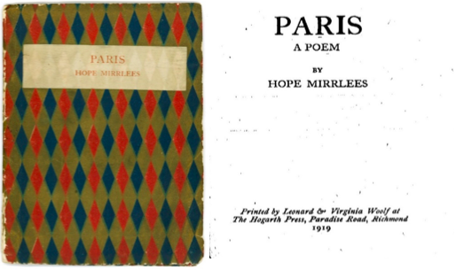
Figure 3: Mirrlees, Paris, cover and first page.
14Paris is a multi-lingual text written in English and French, while also involving many other semiotic codes. Its printing was much delayed because Virginia Woolf, who typeset the Hogarth Press books by herself, had to invest immense efforts in its typesetting. (It has been recently translated into Hebrew where the multi-lingual and the typographic aspects raised many difficulties). These delays are related to the fact that this text a multi-dimensional performance which is almost untranslatable.
15Paris describes a journey of one day in Paris in the end of the Great War: a dramatic moment of turmoil and confusion. But this journey in Paris is not only written, it is performed. This is not a report about a journey, it is the performance of this journey. And this performance is delivered through type.
16The journey in Paris begins when the speaker goes down the metro, where loud advertisements for Zig Zag (cigarettes), Lion Noir (shoe polish), and Cacao Blooker are announced by Capital letters [fig. 4]. The metro is the nord-sud train, which is also the name of a little magazine (edited by Pierre Reverdy) by which Mirrlees was influenced.
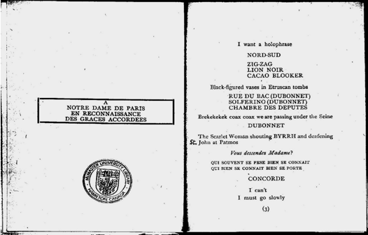
Figure 4: Mirrlees, Paris, opening
17Speech is reported in italics (Vous descendez, Madame ?), and another loud announcement in capitals: she reaches the Concorde station.
18She walks towards le Jardin des Tuileries: (“The Tuileries are in a trance because the painters have stared at them so long”). Typographically the lines are spaced like gardens [fig. 5]. But the gardens are “in a trance” because they have become an artistic cliché. It seems that Mirrlees offers a double gaze on Paris as an actual location where she travels and as a mental symbol, and this twofold journey is replete with surreal urban images.
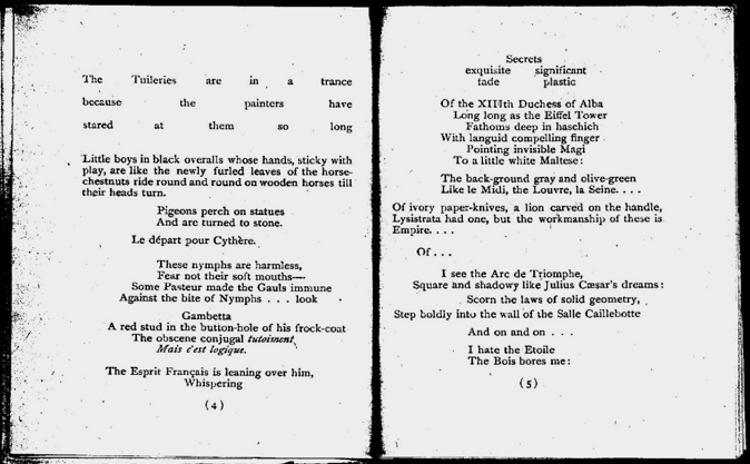
Figure 5 : Mirrlees, Paris
19Mirrlees acts out her experience in Paris through various typographical means, by which she creates the figure of a female flâneur– a flâneuse – wandering through the streets of Paris, experiencing them with all senses: sight, sound, touch.
20We receive an overall staging of her textual experience: voice and pitch (loudness represented by the capital letters, and speech by italics), and space (the gardens are physically present in the text). Yet another moment offers a full staging: a moment of strike in first of May 1919, where a vertical line stages the line of striking workers [fig. 6]. “The first of May: there is no lily of the valley” – A flower, not sold today because of the strike.
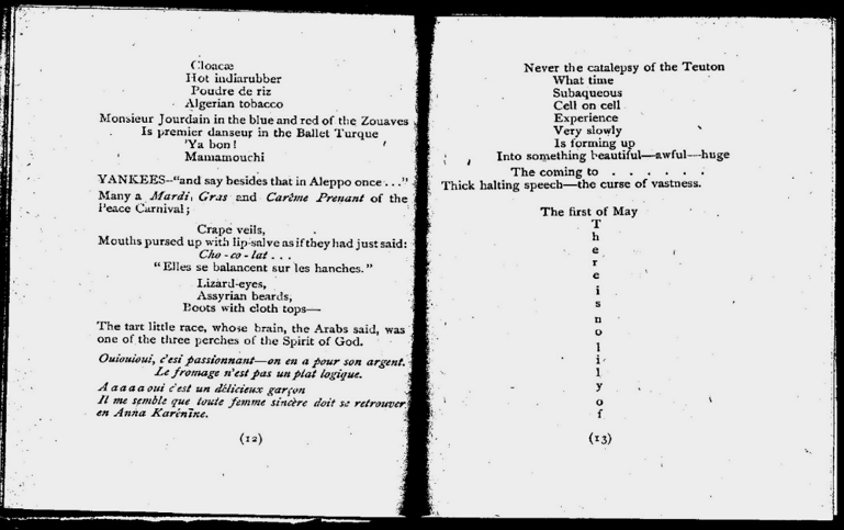
Figure 6 : Mirrlees, Paris
21The text is not only staged, it is even orchestrated. One moment offers us a soundtrack, background music, taken from Frederic Handel’s Opera Rinaldo [fig. 7].
22These are only a few examples of the ways Hope Mirrlees performs experience in this text. The text is highly difficult and challenging to read, and the use of typography makes it even more challenging, as it slows down the reading and demands attention to every enigmatic detail. However it also provides us with a reading key – typography becomes not only a representation of body in space but also a set of reading instructions. When capital letters are used for advertisements, we hear their loudness. When we read the vertical line of the strike we stop, stare, watch, rather than read. We feel the delay that the strike causes the speaker.
Figure 7 : Mirrlees, Paris
23Finally, the overall use of eccentric experimental typography in Paris – the performance with type – enabled Hope Mirrlees to present herself as an eccentric “modernist type”. It enabled her – as an anonymous young woman writer in the Bloomsbury circle – to be seen as a typical modernist. And for a while – it worked. Virginia Woolf was deeply impressed with this work, she saw its power to capture the modernist moment and it actually influenced both her writing and that of T. S. Eliot. The Wasteland was published after T. S. Eliot read Paris, and it contains even similar phrases such as “April” being “the cruelest month”. Recently when Paris was rediscovered by critics it has been declared “modernism’s lost masterpiece”.10
24Interestingly, as opposed to their French contemporaries, the British modernists (the Bloomsbury group, their friends in the Imagist group and the Hogarth press circle members), were not particularly keen on theatrical performances. Their “high” modernism tried to differentiate itself from clownish Dadaist provocations. Nevertheless, typographic experiments enabled them to perform in the text and to be seen as modernist types as well.
25In the sketch of the Hogarth Press [fig. 8] in the Woolfs’ house11 – where Paris was produced (with “Mrs. Woolf composing”, as mentioned there,) the Hogarth Press may seem like the vibrant backstage of a performance. As opposed to the Woolfs’ public visibility as bohemian writers, it presents the hidden technical production process, the wheels of the machine. This publishing house, which became a pilgrimage destination, like a bohemian café, was indeed a stage for the performance of these English modernists – the printing process itself, and its experimental products where their performance.
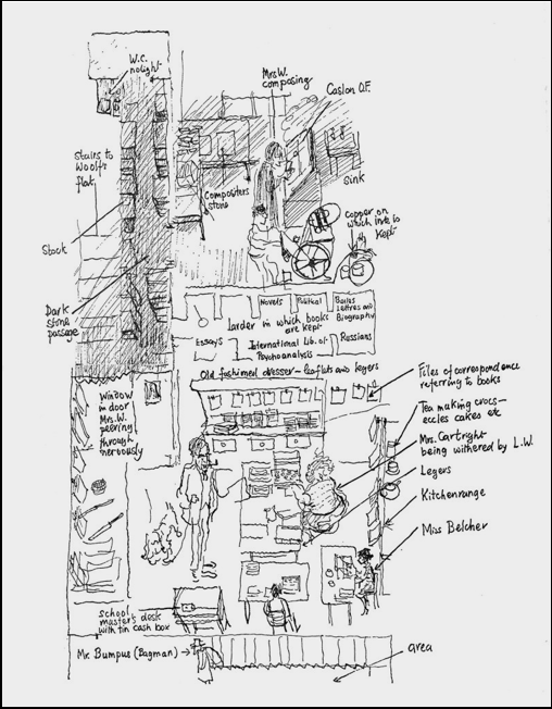
Figure 8: Richard Kennedy, Sketch of the Hogarth Press
26A Final historical remark: The world of typography underwent a massive change in the digital era. The typographical freedom is often replaced with generic interfaces online. If we thought that modern print causes industrialized unification that challenges performance, it turns out that digital typography is much worse. However, the attempt to perform with type is also present today. Not only in creative digital solutions for typographical performances, but also in print. As opposed to the common assumption that “print is dead” or dying, the world of experimental print is actually thriving today. I suspect that while digital type culture take hold, print will continue to fulfill writers’ desire for a medium of experimentation, and perhaps even be more theatrical than ever.